Problem
Several years ago InnerLink created ‘Team Prepared’, a web-based interactive portal for managing school incidents. Lauren Innovations, a subdivision of Lauren International, acquired this product in order to expand its capabilities into a much more robust, yet easy-to-use portal. Lauren Innovations came to Mitchell Allen Group to reposition the product and identity since it now catered to users in education, manufacturing, transportation and healthcare.
Solution
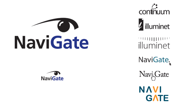
The brand identity development involved the creation of the name, logo and the interface design of the online product. The name search took us in a number of directions before deciding on “NaviGate”. The design was created around key brand attributes of ease, focus, flexibility, clarity, immediacy. The cap “G” clearly identifies the product as a portal or “gate” to search and maneuver. In the final choice, the graphic symbol of an eye was used to embrace the vision and focus of the product. The sans serif type completes a design that is fresh and responsive. The inclusion of “critical information” allows the logo to read as a phrase and turns NaviGate into a verb as well, adding a proactive quality.
Impression
The client loved the logo. We put the logo on a nice polo shirt and handed them out to our clients. They proudly wear these shirts at corporate meetings and conventions.
Responsibilities
Graphic Designer | Concept | Typography
