Problem
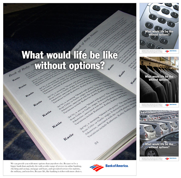
Bank of America is one of the largest commercial bank in the United States. People perceive larger banks as cold, unfriendly places. The campaign’s purpose is to showcase the bank’s benefits by focusing on how plain life would seem with less choices.
Solution
Bigger is better. That is Bank of America’s motto. The campaign focuses on showing everyday circumstances where people have to make choices. Without choices, life is boring.
Impression
Featured in a student advertising campaign competition and nominated for a student Addy Award.
Responsibilities
Art Director | Concept | Layout | Keyline | Photography | Retouching

